Quality Radar
Now I’m back on the blogwagon, I though I’d let you know about one of the things I’ve been doing over the last couple of months.
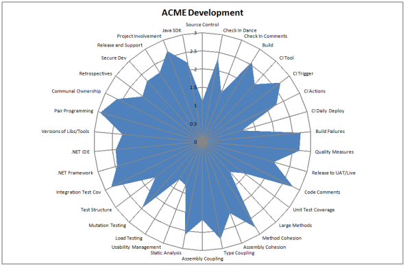
As useful as standards and guidelines are they are very much based in the here and now. What is missing is a statement of the goals for your development practices over the next year or two. Where do you and your organisation want to be over this time frame? To that end I created a mulitple choice survey with each question having 4 answers. The questions used the following scoring system
- 0 = The practice, tool or what-not mentioned in the question is not used / followed
- 1 = It is used / followed, but in an obsolete manner
- 2 = It is used / followed according to current standards
- 3 = It is used / followed according to our future goals
The questions fitted into five broad categories
- Configuration Management
- Tools
- Practices
- Code Quality
- Testing
If you take the averages across all of your development teams you can chart it like so:
At a glance you can tell whether standards are being meet, software quality aspirations are being achieved or that certain aspects of your development practices are below par. The more of the circle that is filled, the better you are at acheiving your goals. When you get scores mainly falling between two and three it is time to raise the bar.
This information is useful in a couple of ways. If you plot the scores in ascending order you can tell what thinds need to improve and spend your effort on them, based on their priority. You can group this info into categories to ascertain if you have any problem categories.
You can also plot individual teams against the average. This enables you to hightlight to all devs what a particular team is good at. It also lets teams know where to get help from other teams who have a higher score for that particular practice.
If you re-run every quarter or so, you can evaluate how the organisation has changed, identifying what worked and what didn’t. It’s basically a retrospective at a higher organisational level.
The Complexity Implementation Tangle
Using relative complexity in your estimation is quite an effective estimating technique. To do this you would normally associate a complexity score to each feature or story. The scale a lot of people used is based on the fibonnaci sequence where next n=previous (previous (n)) + previous (n). You start with 0 and 1 to obtain the following sequnce 1,2,3,5,8,13 etc. You assign points based on the relative complexity where a 2 point story would be roughly twice as complicated as a 1 point story. The power of this approach comes from the comparison – we seem to be naturally better at this than assigning absolute values.
If you take this approach it is very useful to measure how long each story took to implement. With this information in hand you can draw a picture similar to the following
On the top side of the diagram you have the complexity points, scaled appropriately. On the bottom side of the diagram you have implementation time again scaled appropriately. If you plot all of the features on the bottom in the correct position with regards to the time to implement them and draw a straight line back to the complexity point estimate [I know my picture above doesn’t use straight lines, I’ll update the post with a better example] you’ll end up with something along the lines of the diagram above.
In an ideal world all of the features that were estimated as 1 complexity point will have taken you less time to develop than those you estimated as 2 complexity points and so on. Where the lines tangle [cross each other] suggest where your estimation could be improved. Your retrospective can be used to address such issues.
The 56 Complexity Point Dash
Tracking your progress is traditionally done through the use of burn up / burn down charts. I’d like to suggest an alternative – The Sprint.

As you can see it resembles a real race where the length of the course is the sum of the complexity points you intend to deliver for that sprint.
The running line up is:
Lane 1 [Green] : The Pacemaker. Each day she runs the same amount and crosses the finish line at the end of the sprint.
Lane 2 [Red] : You / your team. Every time you complete a feature you can move your runner forward by that amount.
Lane 3…N [Blue and Yellow] : You / your team for the last N sprints. Progress as measured in a previous sprint.
If this information is captured every day, it’d be fairly trivial to track your progress in a visual manner. Simply printing each day and flipping the pages would give you an animated view of your progress throughout the sprint. You can see how far off the pace you are and how you are doing compared to previous sprints. You could even create an animation and send it to the team each day.

